Steve Martin and Calligraphy
Written by Anthony Demangone
I've said it before, and I'll say it again. I Love Steve Martin.
The comedian/author/actor/musician has found success over and over again in different fields. I find him to be thoughtful, curious, and very, very funny.
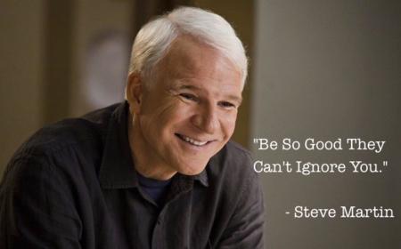
Someone once asked Martin whether he'd share the secret to his success. Without missing a beat, he responded...
"Be so good, they can't ignore you."
Sure, Demangone. That's great for musicians. Or comedians. Â What about an average Joe or Jane?
Well, I don't think anyone has to be average. If they love what they do, and try to improve every day - amazing things can happen.
Don't believe me? Â The New York Times wrote a story about Rev. Robert Palladino, who recently passed away at the age of 83. You should read it.
Rev. Palladino was a Roman Catholic Priest, who spent time as a Trappist Brother. In silence, he honed his skills of calligraphy. And honed them. And honed them more. Â In fact, he became one of the finest calligraphers in the world.Â
In a sense, he became a master in a forgotten art.Â
He left the order, and taught calligraphy at Reed College in Oregon.Â
I'm not sure that many people know about the late Rev. Palladino. But he was so good, the world could not ignore him.
The collegeâÂÂs calligraphy program, which flourished from 1938 until Father PalladinoâÂÂs retirement, was widely regarded as the foremost in the country, training many respected artists, typographers and graphic designers. For decades, nearly every sign and poster on campus was the graceful fruit of its labor.
Mr. (Steve) Jobs briefly attended Reed in 1972 before dropping out for economic reasons, but hung around campus for more than a year afterward; during that time, he audited Father PalladinoâÂÂs class. After helping to found Apple in 1976, he often credited the companyâÂÂs elegant onscreen fonts â and his larger interest in the design of computers as physical objects â to what he had been taught there.
âÂÂI learned about serif and sans serif typefaces, about varying the amount of space between different letter combinations, about what makes great typography great,â Mr. Jobs said in a 2005 commencement address at Stanford. âÂÂIt was beautiful, historical, artistically subtle in a way that science canâÂÂt capture, and I found it fascinating.â He continued:
 âÂÂTen years later, when we were designing the first Macintosh computer, it all came back to me. And we designed it all into the Mac. It was the first computer with beautiful typography. If I had never dropped in on that single course in college, the Mac would have never had multiple typefaces or proportionally spaced fonts. And since Windows just copied the Mac, itâÂÂs likely that no personal computer would have them.âÂÂ
It is likely that no personal computer would have them....
It is just another reminder of a simple truth. No matter what you do, or where you are - if you focus hard enough and long enough, you can move mountains.Â
Â

